After a week of using the T-Mobile G1 – the Google Phone – today I give it back. I knew before trying it that it was junk. Playing with it was still fun. There are great features on this phone, but for the most part it’s a phone to leave behind.
During the week I used the phone as my primary personal cell phone. Usually I carry an iPhone for work and a Nokia N82 for photography and personal calls. Having the iPhone and G1 on me for a week made for some great comparisons and a little benchmarking.
I do not recommend this phone. You should probably not buy this phone. BlackBerry and the iPhone are both superior in almost every aspect.
The Good
- Great (for plastic) screen. Bright, smooth movement, and fairly durable. The Flashlight application is bright.
- Terrific email client (see remarks about keypad below)
- Market (aka Android App Store) describes exactly what systems (GPS, PIM, 3G, etc) an application requires before one installs it
- Excellent USB implementation – The G1 reports as a removable drive when plugged in to a computer, and charges from the USB
- 3G beats the heck out of EDGE – It’s about 75% of the speed of AT&T’s 3G here in Philadelphia, but it’s 4x faster than EDGE
- Amazon MP3 store integration
- 3 megapixel camera has better resolution than the iPhone or current BlackBerry units, but is still antiquated enough to generate smile fatigue
- Hardware keypad is useful for customers who aren’t willing to type more quickly on a virtual keypad
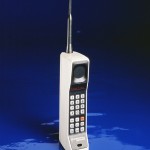
- “Chin” section reminds us of the 1995 Motorola phones – Great way to reminisce

- Google logo on the back
- Not stylish
- Twice as thick as it needs to be – Slide-out screen reveals unfriendly QWERTY keypad, the culprit of this waste
- “Chin” section is unnecessary and uses up an inch of length
- “Chin” section gets in the way in landscape orientation while typing
- Lack of multi-touch, poor trackball
- Can only type with keypad, requires sliding out.
- T-Mobile data plan is slower than AT&T (arguably this will change, but for now it’s 75% as fast as AT&T)
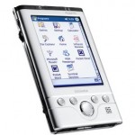
- Too many buttons – Looks like a repurposed Windows Mobile device from 2002

- Weak initial application offerings – lack of apparent payment system for developer compensation
- Android isn’t ready for commercial release – this OS has great potential but its lack of a svelt, smooth, and exciting experience exudes a lack of design

