Google Voice Migration

I’ve wrapped up my set up and migration to Google Voice. Rather than reinvent the wheel, I’m linking to Paul Stamatiou’s review. He sums up my impressions, likes, and dislikes perfectly and has good instructions and screenshots, too.

His experience of getting calls intended for prior phone number holders hasn’t been the case for me. And even if undersirable callers are dialing, one can block, screen, and take control so easily that it becomes a non-issue.

My new number is 707-659-6864 (70s-oly-oung).

Kulling the blogs – down to 196

Maybe it’s Winter preparedness, or maybe it’s a slow news day… But I’m reviewing the blogs I follow, deleting the old, and subscribing to new. I was breaking well over 300 and realized many were dead (in my opinion, a blog that isn’t updated for 6 months is dead).

It’s cleaning time. I’m under 200. Bring on the cold.

Apple’s Mini DisplayPort adapter for DVI and dual-DVI

A Google search for Apple Dual-Link DVI yields a ton of product pages and blog posts about the greatness of Apple’s use of DVI. You’ll get quite a few of Apple’s own product pages, as would be expected. But only a few blogs are calling Apple out.

Apple recently released a new MacBook Pro. It has the most advanced laptop graphics equipment on the market, with dual NVIDIA 9400M and 9600GT chipsets. Apple has also employed a new port type, DisplayPort, that is not the same as Mini-DVI or Micro-DVI. This is a port that is easier to plug in than DVI and supports HDCP (high-bandwidth digital content protection).

People with needs for the best processing horsepower on the go are going to pick up this laptop. These professionals, myself included, are going to be disappointed. If you’re in to a high-end laptop like this you’re probably also pushing 30″ monitors. If not, you should be. But you can’t. The DisplayPort to Dual-Link DVI adapter doesn’t ship for 4-5 weeks (and that’s what they said on October 15th).

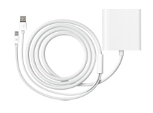
The image above is the dual-link DVI adapter from Apple. It’s a DisplayPort plus USB plug to a DVI female. Why does a dual-link DVI adapter require the addition of a USB plug? Giving up that extra USB port hurts. Paying Apple $99 to move us to a new port type is insulting.

So what’s with the delay? It doesn’t take 4-6 weeks to manufacture cables with DisplayPort, USB, and DVI plugs attached (the site has displayed 4-5 weeks for 4 weeks already). Either development of, or problems in, the circuitry is derailing Apple’s rollout. Or perhaps software driver updates will be required before the DisplayPort + USB adapters can be driven. If the latter, we would expect the adapters to ship at the same time as an OS update drops.

Apple, make this easy. Make it just work…

For more on DisplayPort see DisplayPort: what you need to know (Peter Cohen)

And for a little ridiculousness:

UPDATE: Another theory is that the chip for the adapter requires additional juice. The USB connector would simply be a power chord.

Google in my pocket during Bond Quantum of Solace (the Bolivian Desert)

Besides an absolutely killer Aston Martin opening chase and an even better dog-fight and parachute scene later, two things stuck in my mind from the latest Bond movie, Quantum of Solace.

First, James Bond driving hybrids. Ford got lots of hybrid vehicle product placement (listen for the electric motor during takeoff and stopping).

Second, the Bolivian desert. I didn’t know there was a desert in Bolivia. That ignorance induced the whip-phone-from-pocket reflex to load up some Bolivian geography (sociological pressure kept me from lighting a bright screen in a theater). It wasn’t the movie’s doing, but the ability to supplement one’s experience with personalized metadata is finally here. I’ll remember this when future grandkids ask when we finally started wearing computers.

The movie was good. Not as good as Casino Royale, but I’m liking this style of Bond more than any of the others.

For those stumbling upon this post looking for more on the Bolivian desert try these blogs, photos, and maps:


View Larger Map

Parting with the Google Phone T-Mobile G1 – The Verdict – Top 10

After a week of using the T-Mobile G1 – the Google Phone – today I give it back. I knew before trying it that it was junk. Playing with it was still fun. There are great features on this phone, but for the most part it’s a phone to leave behind.

Last Shot of the G1

During the week I used the phone as my primary personal cell phone. Usually I carry an iPhone for work and a Nokia N82 for photography and personal calls. Having the iPhone and G1 on me for a week made for some great comparisons and a little benchmarking.

I do not recommend this phone. You should probably not buy this phone. BlackBerry and the iPhone are both superior in almost every aspect.

The Good

  1. Great (for plastic) screen. Bright, smooth movement, and fairly durable. The Flashlight application is bright.
  2. Terrific email client (see remarks about keypad below)
  3. Market (aka Android App Store) describes exactly what systems (GPS, PIM, 3G, etc) an application requires before one installs it
  4. Excellent USB implementation – The G1 reports as a removable drive when plugged in to a computer, and charges from the USB
  5. 3G beats the heck out of EDGE – It’s about 75% of the speed of AT&T’s 3G here in Philadelphia, but it’s 4x faster than EDGE
  6. Amazon MP3 store integration
  7. 3 megapixel camera has better resolution than the iPhone or current BlackBerry units, but is still antiquated enough to generate smile fatigue
  8. Hardware keypad is useful for customers who aren’t willing to type more quickly on a virtual keypad
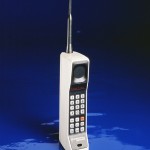
  9. “Chin” section reminds us of the 1995 Motorola phones – Great way to reminisce
  10. Google logo on the back
The Bad
  1. Not stylish
  2. Twice as thick as it needs to be – Slide-out screen reveals unfriendly QWERTY keypad, the culprit of this waste
  3. “Chin” section is unnecessary and uses up an inch of length
  4. “Chin” section gets in the way in landscape orientation while typing
  5. Lack of multi-touch, poor trackball
  6. Can only type with keypad, requires sliding out.
  7. T-Mobile data plan is slower than AT&T (arguably this will change, but for now it’s 75% as fast as AT&T)
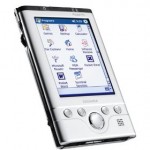
  8. Too many buttons – Looks like a repurposed Windows Mobile device from 2002
  9. Weak initial application offerings – lack of apparent payment system for developer compensation
  10. Android isn’t ready for commercial release – this OS has great potential but its lack of a svelt, smooth, and exciting experience exudes a lack of design
The Verdict – skip this phone – it’s a 1st generation device that is botched by poor hardware design and a pre-release operating system. A G2 or G3 version with a slim multi-touch interface and polished UI will be worthy of your attention.