The Apple Philadelphia Weather Widget Bug

or

Found a funny little bug with Apple’s dashboard weather widget this week. It comes installed and running by default when you set up a new OS X installation or buy a new Mac. I just got a new MacBook Pro a month ago and have been using the weather widget religiously. As John Gruber of Daring Fireball described, it’s one of the favorite widgets (and he has a good old how-to on how to make it better).

But rather than validating by zip code, the weather widget validates by city name only. It grabs the first city name, alphabetically, and plugs that in as your local weather default.

There are five cities in the USA with the name Philadelphia. In alphabetical order, they are Philadelphia MO (Missouri), Philadelphia MS (Mississippi), Philadelphia NY (New York), Philadelphia PA (Pennsylvania), and Philadelphia TN (Tennessee).
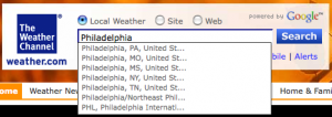
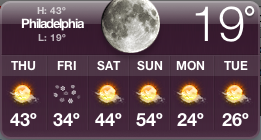
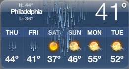
Apple’s widget grabs Philadelphia, MO for Philadelphia, PA (and MS, NY, TN). Until this week the weather patterns for MO vs. PA were the same for precipitation and within a few degrees on temperature. It took a month before the cities were different enough to notice the discrepancy.

For all you’z Philadelphians buying Macs, remember to plug in your 191xx zip codes :) To see this in action if you’re in another city, add a weather widget to the dashboard and search for “Philadelphia”. The same occurs This does not occur on an iPhone’s weather app.

Population data on the Philadelphias:

Apple iPhone Tech Talks – NYC – raw notes on new web app features

iPhone Tech Talk t-shirt NYC frontiPhone Tech Talk t-shirt NYC back

Attending an Apple Tech Talk at the Millennium Hotel New York was a good use of time today. The evangelism team, despite evangelizing, is highly competent and I came away satisfied with decent knowledge consumption.

The event had a massively different feel than John Resig described last year.

There was a lot of JavaScript hate by attendees (“blah blah… GWT is the only thing we trust… blah blah JavaScript is a stupid language…”).

This year it was all about at least 50% about the web. Apple has exposed touch events, multi-touch events, gestures, location based services, and rotation to javascript both for polling and callbacks. Some of the credit for the newfound excitement around Safari and iPhone web apps should probably be shared with WebKit’s HTML5 (file caching and SQLite)… All of which are supported in the iPhone 2.2 OS release.

Over the next few days I’ll have more details on specific highlights. For now, here are my condensed raw notes.Continue Reading

Bug Tracking on the iPhone with JIRA Mate

My dev team uses JIRA for bug tracking. It’s a flexible project management and defect tracking system. As with almost any bug tracking system out there (Bugzilla, Trac, etc), web based defect tracking from a mobile handset is not very user-friendly.

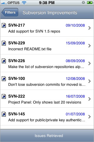
Enter JIRA Mate (formerly JIRA Buddy), written by Shaun Ervine, an application for iPhone and iPod Touch specifically for interfacing with your JIRA database. I was surprised by this application being available before a Bugzilla rev, let alone even being available at all. I’m not complaining. Bugzilla fans should get a move on for their own app.

JIRA Mate simply uses your saved filters allowing you to access your JIRA issues straight from your iPhone.

Since JIRA Mate is helping out your business I guess you could write it off as a tax deduction :)

The app is $8.99 and allows you to pull down issues organized in filters you’ve created in the standard web app, sorted by date (your filter sort setting is not utilized). It does not have issue creation or editing capabilities, but does pull comments and allow you to comment in kind. It’s perfect for keeping your finger on the pulse of your bug database and staying in communication via comments.

Parting with the Google Phone T-Mobile G1 – The Verdict – Top 10

After a week of using the T-Mobile G1 – the Google Phone – today I give it back. I knew before trying it that it was junk. Playing with it was still fun. There are great features on this phone, but for the most part it’s a phone to leave behind.

Last Shot of the G1

During the week I used the phone as my primary personal cell phone. Usually I carry an iPhone for work and a Nokia N82 for photography and personal calls. Having the iPhone and G1 on me for a week made for some great comparisons and a little benchmarking.

I do not recommend this phone. You should probably not buy this phone. BlackBerry and the iPhone are both superior in almost every aspect.

The Good

  1. Great (for plastic) screen. Bright, smooth movement, and fairly durable. The Flashlight application is bright.
  2. Terrific email client (see remarks about keypad below)
  3. Market (aka Android App Store) describes exactly what systems (GPS, PIM, 3G, etc) an application requires before one installs it
  4. Excellent USB implementation – The G1 reports as a removable drive when plugged in to a computer, and charges from the USB
  5. 3G beats the heck out of EDGE – It’s about 75% of the speed of AT&T’s 3G here in Philadelphia, but it’s 4x faster than EDGE
  6. Amazon MP3 store integration
  7. 3 megapixel camera has better resolution than the iPhone or current BlackBerry units, but is still antiquated enough to generate smile fatigue
  8. Hardware keypad is useful for customers who aren’t willing to type more quickly on a virtual keypad
  9. “Chin” section reminds us of the 1995 Motorola phones – Great way to reminisce
  10. Google logo on the back
The Bad
  1. Not stylish
  2. Twice as thick as it needs to be – Slide-out screen reveals unfriendly QWERTY keypad, the culprit of this waste
  3. “Chin” section is unnecessary and uses up an inch of length
  4. “Chin” section gets in the way in landscape orientation while typing
  5. Lack of multi-touch, poor trackball
  6. Can only type with keypad, requires sliding out.
  7. T-Mobile data plan is slower than AT&T (arguably this will change, but for now it’s 75% as fast as AT&T)
  8. Too many buttons – Looks like a repurposed Windows Mobile device from 2002
  9. Weak initial application offerings – lack of apparent payment system for developer compensation
  10. Android isn’t ready for commercial release – this OS has great potential but its lack of a svelt, smooth, and exciting experience exudes a lack of design
The Verdict – skip this phone – it’s a 1st generation device that is botched by poor hardware design and a pre-release operating system. A G2 or G3 version with a slim multi-touch interface and polished UI will be worthy of your attention.